

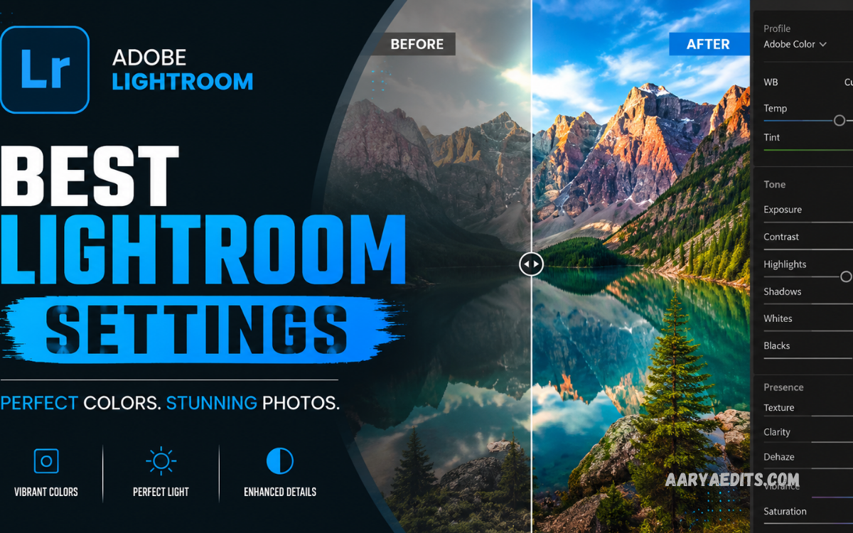
Finding the Best Lightroom Settings can transform ordinary photos into polished, professional-looking images. Adobe Lightroom provides powerful controls for exposure, color, contrast, detail, and effects, allowing photographers and creators to build consistent editing styles. The right settings depend on the photo, lighting conditions, camera, and desired mood. However, a reliable starting point can make the editing process faster and easier.
Professional Lightroom editing is not about applying extreme adjustments. It is about creating balance while preserving natural details, accurate colors, and realistic skin tones. Whether you edit portraits, landscapes, street photography, travel images, or social media content, understanding the main Lightroom controls helps you achieve better results.
What Are the Best Lightroom Settings?
The Best Lightroom Settings are balanced adjustments that improve exposure, contrast, color, sharpness, and overall image quality without making the photo look unnatural. A strong Lightroom workflow usually begins with exposure and white balance before moving toward highlights, shadows, colors, and details.
A useful starting point includes moderate contrast, controlled highlights, slightly lifted shadows, balanced whites and blacks, and appropriate texture. These values should never be treated as universal because every photograph has different lighting and tonal information.
Best Lightroom Settings for Beginners
Beginners should start with basic adjustments rather than changing every slider. Open the photo in Lightroom and examine exposure, white balance, highlights, shadows, whites, and blacks first. These controls have the biggest influence on the overall appearance.
For a natural look, try reducing excessive highlights, lifting shadows slightly, and adjusting contrast moderately. Texture and clarity should be used carefully because excessive values can create harsh details. Once the basic tones look balanced, move toward color and sharpening adjustments.
Recommended Basic Settings
The Basic panel is one of the most important areas in Lightroom. A useful starting point for many photos can include Exposure between -0.20 and +0.30, Contrast around +5 to +15, Highlights around -20 to -50, and Shadows around +15 to +40.
Whites and Blacks can then be adjusted according to the histogram. Increasing Whites slightly can create brightness, while lowering Blacks can add depth. Avoid pushing these controls too far because clipped highlights or crushed shadows can permanently reduce visible detail.
Best Exposure Settings
Exposure determines the overall brightness of the image. Correct exposure should be the first priority because color and contrast adjustments become difficult when the photograph is excessively bright or dark.
Use the histogram to evaluate tonal distribution instead of relying only on the appearance of your screen. A good exposure normally preserves important details across bright and dark areas. Small adjustments are usually better than large corrections.
Best Contrast Settings
Contrast controls the difference between bright and dark areas. Increasing contrast can make an image appear stronger and more dramatic, while reducing contrast creates a softer appearance.
For professional editing, moderate contrast is usually more effective than extreme contrast. Start with a small positive adjustment and inspect the result at different zoom levels. Portraits often benefit from softer contrast, while landscapes and architecture can tolerate stronger tonal separation.
Best Highlights and Shadows Settings
Highlights and Shadows are essential for recovering detail. Lowering Highlights can restore information in bright skies, windows, or reflective surfaces. Increasing Shadows can reveal details in darker areas.
A common starting point is Highlights between -20 and -50 and Shadows between +15 and +40. However, the correct values depend heavily on the original exposure. Avoid lifting shadows excessively because doing so can introduce noise and reduce image depth.
Best White Balance Settings
White Balance controls the temperature and tint of an image. Incorrect white balance can make photos appear too blue, yellow, green, or magenta.
Use Lightroom’s White Balance tools to establish a neutral starting point. The Temperature slider controls warm and cool tones, while Tint corrects green or magenta color shifts. For portraits, prioritize natural-looking skin tones rather than simply making the image warmer.
Best Color Settings
Color adjustments can completely change the mood of a photograph. Lightroom provides Vibrance and Saturation controls for increasing or reducing overall color intensity.
Vibrance is generally safer for natural editing because it increases less-saturated colors more selectively. Saturation affects almost every color and can quickly make an image look unrealistic. Start with small adjustments and compare the edited version with the original.
Best HSL Settings
The HSL panel provides separate control over Hue, Saturation, and Luminance for individual colors. It is especially useful for landscape, travel, fashion, and social media photography.
Instead of changing every color, identify the colors that dominate your photograph. You might adjust green tones for foliage, blue tones for skies, or orange tones for skin. Small changes can create a consistent visual style without damaging natural colors.
Best Texture, Clarity, and Dehaze Settings
Texture, Clarity, and Dehaze can add definition, but they should be used carefully. Texture enhances smaller details, Clarity affects midtone contrast, and Dehaze strengthens atmospheric contrast.
For general photography, modest adjustments are usually best. Excessive Clarity can make portraits look harsh, while too much Dehaze can create unnatural contrast and color intensity. These tools work best when applied according to the subject and intended style.
Best Lightroom Settings for Portraits
Portrait editing requires careful control of skin tones, highlights, texture, and sharpness. Start by creating a balanced exposure and natural white balance. Reduce harsh highlights and gently lift shadows when necessary.
Keep Texture and Clarity moderate, especially around skin. Use HSL controls carefully if skin appears too red, orange, or yellow. The goal should be clean and natural skin rather than an overly smooth or heavily processed appearance.
Best Lightroom Settings for Landscapes
Landscape photos often benefit from stronger detail, controlled highlights, and enhanced colors. Begin by correcting exposure and recovering highlight information in bright skies.
Moderate Texture, Clarity, and Dehaze can emphasize mountains, buildings, clouds, and other environmental details. Vibrance can also improve colors while maintaining a more natural appearance. Avoid excessive saturation because it can make foliage and skies look artificial.
Best Lightroom Settings for Mobile Photos
Lightroom Mobile offers many of the same essential editing controls found in the desktop version. A simple workflow is useful when editing photos directly from a smartphone.
Begin with exposure, white balance, highlights, and shadows. Adjust contrast and color afterward. For social media images, maintain enough brightness and color to make the photo visually clear while preserving realistic details.
Best Lightroom Settings for Instagram Photos
Instagram photography often benefits from clean exposure, balanced contrast, and consistent colors. Rather than using different editing styles for every image, create a repeatable workflow.
A useful approach is to establish a base preset containing exposure, contrast, color, and detail adjustments. Fine-tune each photograph afterward because lighting conditions can vary. Consistency across multiple images can create a more professional-looking feed.
Best Lightroom Settings for Night Photography
Night photos require special attention to exposure, noise, and highlights. Increasing exposure too much can reveal excessive noise, while lifting shadows aggressively can make dark areas look muddy.
Use the Detail panel to apply appropriate noise reduction and sharpening. Keep highlights controlled, especially around streetlights and bright signs. Slightly reducing contrast may help preserve details in darker scenes.
Best Lightroom Settings for Sharp Photos
Sharpness should enhance genuine detail rather than create artificial edges. Lightroom’s Sharpening controls include Amount, Radius, Detail, and Masking.
A moderate Amount combined with suitable Masking can improve detail while limiting sharpening on smoother areas. Always inspect sharpening at 100% zoom. Excessive sharpening can create halos, grain, and unnatural textures.
Best Noise Reduction Settings
Noise reduction is useful when photographs are captured at high ISO or in low-light environments. Lightroom provides separate controls for luminance and color noise.
Apply only the amount necessary to improve image quality. Too much noise reduction can remove fine details and make photographs appear overly smooth. Combine moderate noise reduction with careful sharpening for a better balance.
Read Also: Lightroom Object Removal: Complete Guide to Removing Unwanted Objects
Best Lightroom Settings for RAW Photos
RAW files provide extensive editing flexibility because they contain significantly more image information than compressed formats. This makes them ideal for exposure, white balance, highlight, and shadow adjustments.
When editing RAW images, begin with the camera profile and white balance before making detailed corrections. Preserve as much tonal information as possible during the initial adjustments. This creates a strong foundation for creative editing.
How to Create Your Own Lightroom Preset
Creating a preset can save considerable editing time. First, edit a photograph until the overall style looks consistent with your goals. Then save the adjustments as a preset while excluding settings that should vary between photographs, such as exposure and white balance.
Test the preset on photographs captured under different lighting conditions. A good preset should provide a useful starting point rather than forcing every image to use identical settings.
Common Lightroom Editing Mistakes
One common mistake is excessive saturation. Bright colors may initially look impressive, but they can quickly become unrealistic. Another mistake is pushing clarity or sharpening too far, which can create harsh textures.
Ignoring white balance is another frequent problem. Even strong exposure adjustments cannot fully compensate for unnatural color temperature. Finally, avoid editing exclusively by looking at one zoom level. Check both the overall composition and fine details before exporting.
How to Improve Your Lightroom Workflow
A professional workflow should be systematic. Start by organizing and selecting your photographs, then correct exposure and white balance before making creative adjustments.
After basic corrections, refine contrast, highlights, shadows, colors, and details. Compare the edited photograph with the original frequently. Finally, check the image at full size before exporting. This process helps prevent small editing problems from becoming obvious in the final image.
Frequently Asked Questions
What are the Best Lightroom Settings for beginners?
The best starting point is balanced exposure, moderate contrast, controlled highlights, slightly lifted shadows, accurate white balance, and modest color adjustments. Beginners should make small changes and review the image after every major adjustment.
Should I use the same Lightroom settings for every photo?
No. Different photographs have different lighting, exposure, colors, and subjects. A preset can provide a useful foundation, but exposure, white balance, highlights, and shadows often need individual adjustments.
What Lightroom settings make photos look professional?
Professional results usually come from balanced exposure, natural colors, controlled highlights, appropriate contrast, clean detail, and careful sharpening. Subtle adjustments generally produce more realistic results than extreme editing.
Is Lightroom better for RAW photos?
Yes. Lightroom is particularly powerful for RAW files because they provide extensive information for adjusting exposure, white balance, highlights, shadows, and color. RAW editing gives greater flexibility than heavily compressed image formats.
What is the best Lightroom setting for skin tones?
Natural white balance and moderate color adjustments are more important than a specific numerical setting. Use HSL controls carefully and avoid excessive saturation, texture, clarity, or sharpening on skin.
How much clarity should I use in Lightroom?
There is no universal value. Start with a small adjustment and evaluate the subject. Portraits generally require more restraint, while landscapes and architecture can often handle stronger clarity.
How can I make Lightroom edits look natural?
Use small adjustments, preserve highlight and shadow detail, maintain realistic skin tones, and avoid excessive saturation. Comparing your edit with the original can help prevent over-processing.
Can I save the Best Lightroom Settings as a preset?
Yes. Lightroom allows you to save many editing adjustments as presets. Create a base preset for your preferred style, then customize exposure and other image-specific settings for each photograph.
Conclusion
The Best Lightroom Settings are not fixed numbers that work perfectly for every photograph. They are balanced adjustments designed to improve exposure, color, contrast, detail, and mood while preserving the natural character of the image.
Start with basic corrections, make small changes, and use the histogram and preview tools to evaluate your results. As your editing experience improves, experiment with HSL, curves, color grading, masking, sharpening, and presets. Developing a consistent workflow is more valuable than relying on a single preset or collection of slider values.
