

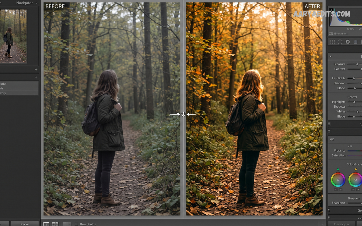
Lightroom Before and After comparisons provide a clear way to understand how professional photo editing can transform an ordinary image into a polished visual. Adobe Lightroom gives photographers precise control over exposure, color, contrast, highlights, shadows, details, and composition without destroying the original photograph.
A strong before-and-after comparison does more than showcase editing skills. It demonstrates how carefully selected adjustments can enhance mood, depth, color accuracy, skin tones, and overall visual balance while preserving the photograph’s natural character.
What Does Lightroom Before and After Mean?
Lightroom Before and After refers to a visual comparison between an original photograph and its edited version created in Adobe Lightroom. The before image shows the camera’s original capture, while the after image displays the result after adjustments have been applied.
This comparison helps photographers identify which editing decisions led to the greatest improvements. Exposure correction, white balance, tonal adjustments, color grading, sharpening, cropping, and selective edits can each contribute to a noticeable transformation.
Why Do Lightroom Before-and-After Comparisons Matter?
A before-and-after comparison makes editing progress easier to evaluate because viewers can immediately see the difference between the unedited and finished photograph. Instead of describing an editing process, photographers can demonstrate its practical effect through a direct visual comparison.
For beginners, these comparisons provide useful learning opportunities. Studying the original image alongside the final result can reveal how professional photographers manage difficult lighting, muted colors, excessive highlights, underexposure, distracting backgrounds, and inconsistent skin tones.
Understanding the Original Photo Before Editing
Professional editing begins with careful observation rather than immediately moving sliders. Before changing an image, examine exposure, dynamic range, white balance, color relationships, composition, highlights, shadows, and distracting elements.
The goal should be to identify what the photograph actually needs. A dark image may require exposure correction, while a flat photograph might need stronger contrast. An image with inaccurate colors may require white-balance correction before any creative color grading begins.
Importing Photos Into Lightroom
Importing photographs into Lightroom provides access to a complete editing workflow that can be adapted for portraits, landscapes, weddings, travel photography, street photography, products, and social media content. Maintaining organized files also makes future comparisons easier.
After importing an image, photographers should inspect the photograph at different zoom levels. A full-frame view reveals composition and overall balance, while closer inspection exposes problems involving noise, sharpness, skin texture, focus, and small distractions.
Creating a Lightroom Before and After Comparison
Creating an effective Lightroom Before and After comparison starts with preserving the original photograph. Lightroom’s non-destructive editing workflow allows photographers to experiment with adjustments while retaining the original image data.
Once editing is complete, compare the edited version against the original. Look for improvements rather than simply stronger effects. Professional editing should enhance the photograph’s strengths, correct technical weaknesses, and support the intended mood without making the result appear artificial.
Exposure Adjustment
Exposure is one of the most important controls in Lightroom because it affects the overall brightness of an image. An underexposed photograph may lose visible detail in darker areas, while excessive exposure can make bright portions appear washed out.
During a Lightroom Before and After comparison, exposure adjustments should create a more balanced tonal structure. Increase or decrease exposure gradually, then inspect highlights and shadows to ensure the image retains sufficient detail throughout the tonal range.
Contrast Adjustment
Contrast controls the separation between lighter and darker areas. Increasing contrast can make an image appear more powerful and defined, while reducing contrast can produce a softer and more subtle appearance.
Professional editing requires moderation. Excessive contrast can remove shadow detail and create harsh highlights. A balanced contrast adjustment should strengthen depth while maintaining natural transitions between different tonal values.
Highlights and Shadows
The Highlights and Shadows controls are essential when recovering detail from challenging lighting conditions. Lowering highlights can restore information in bright skies, reflective surfaces, or illuminated skin, while raising shadows can reveal details hidden in darker areas.
A strong Lightroom Before and After result often depends on achieving better dynamic balance rather than simply increasing brightness. Carefully adjusted highlights and shadows can create a cleaner image with greater depth and improved visual information.
Whites and Blacks
Whites and Blacks establish the brightest and darkest points within a photograph. Adjusting these controls can improve tonal range and give an image greater definition.
Whites can help create brightness and clarity, while Blacks can add depth and visual weight. However, pushing either control too far may cause clipping. Professional results require monitoring the histogram and checking important details after every major tonal adjustment.
White Balance Correction
White balance determines whether an image appears warm, cool, neutral, green, or magenta. Incorrect white balance can make skin tones appear unnatural and can change the emotional character of an entire photograph.
Lightroom provides Temperature and Tint controls for correcting these issues. Before applying creative color grading, establish a believable neutral foundation. This makes subsequent color adjustments more predictable and easier to control.
Color Temperature and Mood
Color temperature can dramatically change the emotional impact of an image. Warmer tones often create feelings associated with sunlight, comfort, nostalgia, and warmth, while cooler tones can produce a cleaner, calmer, or more dramatic atmosphere.
The best Lightroom Before and After edits use temperature intentionally rather than following a fixed formula. Consider the subject, lighting conditions, environment, and intended audience before selecting a final color temperature.
Vibrance and Saturation
Vibrance and Saturation both affect color intensity, but they behave differently. Saturation changes the intensity of colors across the image, while Vibrance generally provides a more selective approach to increasing color strength.
For professional editing, Vibrance can be useful when an image needs additional color energy without making every color excessively intense. Saturation should be applied carefully because aggressive adjustments can produce unrealistic skin tones and overly bright environmental colors.
HSL Color Editing
The HSL panel provides control over Hue, Saturation, and Luminance for individual color ranges. This makes it possible to refine specific colors without dramatically changing the entire photograph.
For example, photographers can modify green foliage, blue skies, orange skin tones, or yellow architectural surfaces independently. HSL adjustments can produce a sophisticated Lightroom Before and After transformation while maintaining greater control than global saturation adjustments.
Read Also: Professional Wedding Photo Editing Tips 2026
Tone Curve Editing
The Tone Curve provides advanced control over tonal relationships. Photographers can use it to create subtle contrast, soften highlights, deepen shadows, or develop a distinctive visual style.
A gentle S-curve can increase perceived contrast by darkening selected shadows and brightening selected highlights. More advanced curves can create cinematic, matte, faded, or high-contrast appearances when applied carefully.
Lightroom Color Grading
Color Grading allows photographers to introduce controlled color into shadows, midtones, and highlights. This technique can create visual harmony and establish a recognizable editing style.
A professional color grade should support the photograph rather than overpower it. Subtle complementary colors can create depth, while excessive grading may distract from the subject and make the image appear heavily processed.
Skin Tone Editing
Portrait editing requires special attention because skin tones are highly sensitive to color and exposure changes. Small adjustments can make a major difference in how natural a person appears.
When creating a Lightroom Before and After portrait comparison, maintain realistic skin color while improving exposure, contrast, texture, and background tones. Avoid excessive saturation, clarity, or sharpening on skin because these adjustments can produce an unnatural appearance.
Portrait Editing Workflow
A professional portrait workflow often begins with exposure and white-balance correction. After establishing a strong foundation, photographers can refine highlights, shadows, contrast, color, skin tones, and background elements.
Selective masking can then direct attention toward the subject. Brightening the face slightly, controlling distracting colors, or reducing background emphasis can improve visual hierarchy without requiring extreme global adjustments.
Landscape Editing Workflow
Landscape photography often benefits from careful control over dynamic range, sky exposure, vegetation color, and atmospheric depth. Lightroom provides tools for recovering highlights and enhancing shadow information within complex outdoor scenes.
For a strong Lightroom Before and After landscape result, avoid excessive saturation. Natural landscapes usually appear more convincing when color, contrast, and clarity are enhanced selectively rather than pushed aggressively across the entire frame.
Wedding Photography Editing
Wedding photography requires consistency, natural skin tones, controlled highlights, and reliable color reproduction. Since wedding galleries often contain hundreds of images, maintaining a consistent editing style is essential.
Lightroom’s synchronization and preset features can accelerate repetitive adjustments. However, every photograph should still receive individual attention because lighting conditions, backgrounds, exposure levels, and skin tones can vary considerably between scenes.
Street Photography Editing
Street photography frequently contains mixed lighting, strong shadows, vibrant colors, and distracting backgrounds. Lightroom can help create visual hierarchy by balancing exposure and controlling colors.
A successful street-photo transformation does not necessarily require dramatic editing. Small improvements in contrast, tonal balance, cropping, and selective color can make the subject more prominent while preserving the authenticity of the scene.
Mobile Photography and Lightroom
Lightroom is also widely used for editing photographs captured with smartphones. Modern phones can produce detailed images, but challenging lighting may still result in excessive highlights, muted colors, or inconsistent white balance.
A carefully edited mobile photograph can become significantly more polished through exposure correction, shadow recovery, color refinement, sharpening, and noise reduction. The Lightroom Before and After comparison makes these improvements particularly easy to evaluate.
Using Lightroom Presets
Lightroom presets apply a predefined collection of editing adjustments to photographs. They can provide a useful starting point for photographers who want consistent visual characteristics across a collection.
Presets should not be treated as a complete editing solution. Different photographs contain different lighting conditions and colors, so exposure, white balance, highlights, shadows, and skin tones may still require manual refinement after applying a preset.
Before and After for Instagram Photos
Social media photographs often benefit from clean color, strong subject separation, and consistent visual identity. Lightroom can help photographers develop a recognizable editing style across Instagram posts.
However, social media editing should remain appropriate for the subject. Travel photographs may benefit from vibrant environmental colors, portraits often require natural skin tones, and minimalist photographs may look stronger with restrained contrast and saturation.
Before and After for Professional Photography
Professional photography requires more than visually impressive editing. Images must maintain accurate details, appropriate color relationships, consistent exposure, and a coherent visual identity.
A professional Lightroom Before and After presentation demonstrates technical improvement while revealing the photographer’s creative decisions. The strongest examples show restraint, intentionality, and a clear connection between the original image and the final result.
How to Make Lightroom Edits Look Natural
Natural editing depends on controlled adjustments rather than extreme slider movements. Begin with technical corrections, then refine tonal balance and color before applying creative effects.
Zoom out regularly to evaluate the complete photograph. An adjustment that looks impressive at high magnification may appear excessive at normal viewing size. Always judge the final image according to its intended viewing environment.
Common Lightroom Editing Mistakes
One common mistake is excessive saturation. Strong colors may initially appear attractive, but they can quickly make photographs look unrealistic. Another frequent problem is excessive clarity or texture, particularly in portraits.
Overexposure correction, crushed shadows, aggressive sharpening, heavy color grading, and excessive contrast can also reduce image quality. Professional editing requires knowing when to stop rather than continually adding effects.
Comparing Before and After Results
A useful comparison should preserve the same crop, orientation, and viewing conditions. Changing the composition between the original and edited images can make it difficult to determine which improvements came from editing.
Place the original and edited versions side by side whenever possible. Examine exposure, color, contrast, details, skin tones, background distractions, and overall mood. This approach makes weaknesses easier to identify and encourages more disciplined editing decisions.
Using the Lightroom Histogram
The histogram provides a visual representation of tonal distribution from dark shadows to bright highlights. It can help photographers identify potential clipping and understand how adjustments are changing the photograph.
Although the histogram is valuable, it should not replace visual judgment. A technically balanced histogram does not automatically produce a compelling photograph. Use histogram information alongside composition, subject requirements, lighting, and creative intent.
Lightroom Masking for Precise Editing
Masking allows photographers to apply adjustments to specific areas rather than changing the entire image. Subject, sky, background, brush, linear gradient, and radial gradient tools provide different ways to isolate important regions.
Masking can improve portraits, landscapes, products, and commercial images. For example, photographers can brighten a subject while slightly reducing background brightness, producing stronger separation and directing attention toward the primary point of interest.
Detail, Sharpening, and Noise Reduction
Sharpening can improve perceived detail, but excessive sharpening may introduce halos and harsh edges. Noise reduction can help clean images captured at high ISO settings, although excessive noise reduction may remove fine texture.
For professional results, apply sharpening according to the image’s resolution and intended output. Review the photograph at both normal viewing size and closer magnification to ensure detail remains natural.
Cropping and Composition
Cropping can significantly improve a photograph by removing distractions, strengthening subject placement, and creating better visual balance. Lightroom provides flexible cropping tools that can be used alongside aspect-ratio controls.
A before-and-after comparison should make it clear whether composition has improved. Avoid unnecessary cropping that removes important context or reduces image resolution beyond practical requirements.
Removing Distracting Elements
Unwanted objects can reduce the impact of an otherwise strong photograph. Lightroom’s removal tools can help clean up small distractions such as spots, wires, minor objects, or other unwanted visual elements.
Retouching should remain believable. Removing every environmental detail can make a photograph feel artificial, particularly in documentary, street, travel, and lifestyle photography where authenticity is part of the image’s character.
Creating a Consistent Editing Style
A recognizable editing style develops through repeated decisions involving contrast, color, exposure, saturation, and tonal relationships. Consistency becomes especially important for photographers working on galleries, portfolios, campaigns, or social media feeds.
Instead of copying a popular editing style exactly, analyze what makes it effective. Identify its tonal structure, color palette, contrast level, and treatment of highlights and shadows, then adapt those principles to your own photographic work.
How to Showcase Lightroom Before and After Work
When presenting editing work, use clear labels such as Original and Edited. Maintain identical dimensions whenever possible so viewers can concentrate on the transformation rather than differences in presentation.
A strong portfolio can include several examples covering different genres. Portraits, landscapes, wedding images, product photographs, and low-light scenes can demonstrate versatility and show how editing decisions change according to photographic conditions.
Lightroom Before and After for Beginners
Beginners should focus on mastering fundamental adjustments before experimenting with advanced effects. Exposure, white balance, highlights, shadows, contrast, whites, blacks, and basic color controls provide a strong foundation.
Practice by editing the same photograph multiple times with different approaches. Compare each result with the original and identify which adjustments improved the photograph and which ones created unwanted effects. This method develops editing judgment faster than relying exclusively on presets.
Professional Lightroom Workflow
A reliable professional workflow begins with organization and technical assessment. Import photographs, organize collections, select the strongest images, correct exposure and white balance, refine tones, adjust colors, apply local edits, and complete detail work.
After editing, review the full collection for consistency. Compare similar images side by side and correct noticeable differences in brightness, color temperature, contrast, and skin tones. A consistent gallery generally appears more professional than a collection of individually impressive but visually unrelated images.
Lightroom Before and After Editing Tips
Always begin with a clear objective. Decide whether the photograph requires correction, enhancement, creative grading, or a combination of these approaches before moving multiple controls.
Keep adjustments gradual and review the original frequently. If an edited photograph becomes dramatically different without a clear creative reason, reduce the intensity. The best Lightroom Before and After transformations often involve subtle improvements that collectively produce a major visual difference.
Frequently Asked Questions
What is Lightroom Before and After?
Lightroom Before and After is a comparison between an original photograph and its edited version created in Adobe Lightroom. It shows how adjustments such as exposure, contrast, color, highlights, shadows, and white balance can improve the final image.
Why is Lightroom Before and After important?
A Lightroom Before and After comparison helps photographers understand the impact of editing decisions. It also makes it easier to identify improvements in color, lighting, detail, composition, and overall image quality.
How do I see Before and After in Lightroom?
You can use Lightroom’s Before and After comparison feature to view the original and edited versions of a photograph. This allows you to evaluate your adjustments and decide whether the final result looks natural and balanced.
Can Lightroom improve smartphone photos?
Yes. Lightroom can improve smartphone photographs by correcting exposure, white balance, colors, shadows, highlights, sharpness, and noise. Proper adjustments can make mobile photos look more polished and professional.
What Lightroom adjustments make the biggest difference?
Exposure, white balance, highlights, shadows, contrast, color, and masking often produce the most noticeable improvements. The ideal combination depends on the original photograph and the desired editing style.
Are Lightroom presets good for Before and After editing?
Lightroom presets can provide a useful starting point for Before and After editing. However, presets often require additional adjustments because every photograph has different lighting, colors, exposure, and subject characteristics.
How can I make Lightroom edits look natural?
Use moderate adjustments and avoid excessive saturation, contrast, clarity, sharpening, and color grading. Compare the edited photograph with the original regularly to ensure the final image remains realistic.
Conclusion
Lightroom Before and After comparisons demonstrate the practical value of thoughtful photo editing. From exposure and white balance to color grading, masking, sharpening, and composition, Lightroom provides a comprehensive environment for refining photographs while preserving the original image.
Professional editing is ultimately about decision-making rather than applying the strongest effects. A successful final image should communicate the photographer’s intention, maintain believable details, and create a stronger visual experience than the original capture.
